Page 73 [73]
721] Digital Media and Storytelling in Higher Education
of communication (n = 45) on different interfaces (e.g., blogs, news portals,
and platforms specifically dedicated to DDS, such as Tableau or Infogram) to
explore different types of DDS. The common feature of the interfaces was that
their creators determined the order of visual elements by narrative elements.
The research team found that the narratives contained both textual and iconic
representations. The means of expressing the narrative and explaining the
context included flowcharts with labels, text displayed in visualizations and
the highlighting of text or visual elements. The elements of the narratives were
linked to each other by interactions, similar colors, or animations. Navigation
of the visualizations was assisted by previous/next buttons, section buttons,
table of contents or maps. The exploration by the recipients was facilitated
by the creators through innovative tools such as dynamic, embedded, and
stand-alone visualizations.
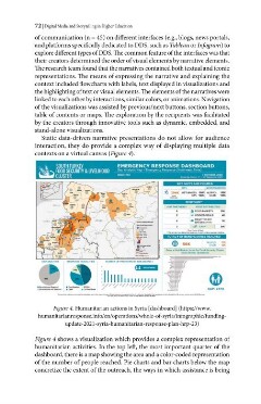
Static data-driven narrative presentations do not allow for audience
interaction, they do provide a complex way of displaying multiple data
contexts on a virtual canvas (Figure 4).
FOOD SECURITY & LIVELIHOOD _S2r 2 Emergency R hwest Syria
(Han in LE
À aan BENDER 14K ALEPPO 128K
160K IDLEB 166K
ies
# OF PARTNERS“ FOOD DISTRIBUTION
6 & FOOD BASKETS 28K
2 S COOKED MEALS 4K
READY TO EAT
. > RATIONS erro) ™
2 ED CASH 20K
“Crete int 38 ay
78 parer may dave od petrance Drearh maple reepa modult en.
TOTAL # OF BENEFICIARIES REACHED
ALEPFO 21K
e 56K IDLEB 35K
Gaps at Sub-District Level for Food Security Cluster
Date: 30 Sestomoe 2530
RESPONSE MODALITIES NUMBER OF PARTNERS BY SUB-DISTRICT
ee
€
Cross Border Operations
um
ll
1 Benetoaies Reached WFood Sake RTERE
Banenchanien
Petfinscnes | m Caen Cooked Meats + mar GAP: 237K
Im Z Diem Dom. Lay OE Sone CIN TT A eure Omar Sa FW.
Figure 4. Humanitarian actions in Syria [dashboard] (https://www.
humanitarianresponse.info/en/operations/whole-of-syria/infographic/funding¬
update-2021-syria-humanitarian-response-plan-hrp-23)
Figure 4 shows a visualization which provides a complex representation of
humanitarian activities. In the top left, the most important quarter of the
dashboard, there is a map showing the area and a color-coded representation
of the number of people reached. Pie charts and bar charts below the map
concretize the extent of the outreach, the ways in which assistance is being